eMAG

Brand consultancy, 2021 — the emotional layer

What affection is worth to a market leader — and how to earn it

In 2021, at twenty years, eMAG had little left to prove commercially. It was Romania's second most valuable brand, its brand value had more than doubled in five years, and it had built the country's convenience economy. Leaders at that stage face a different question, and eMAG asked it plainly: trust it had earned — could it also be loved?

Brandient treated the question with rigor rather than flattery. Affection has real commercial value for a leader — steadier margins, customers who forgive a bad day and resist a rival's discount, a stronger hand in recruiting. But its limits are real too: generalist e-commerce is a category built on usefulness, where speed, range and accessibility keep relationships practical. A transformation into a "love brand" would have promised more than the category can deliver, and Brandient said so.

The counsel instead drew a working distinction between habit and preference — between the attachment that comes from being reliable and the attachment that comes from how a brand makes people feel about themselves — and proposed building the second without disturbing the first: deliberately, and measurably.

The result was a program the organization could act on: eight defined ways customers want to see themselves through the brand, each matched with practical moves across communication, experience and measurement. It closed the arc that began in 2010 — the first decade earned leadership; the next earns affection.

Client:
eMAG

Industry:
E-commerce

Project type:
Brand Consultancy Specific Solutions

Year:
2021

Services:
Brand Audit; Brand Positioning; Brand Name, Narratives and Voice

Rebranding, 2019—Design upgrade

Articulating the e-commerce leader through a decade of branding

The new logo design was conceived to increase the brand’s visibility and modernize it, transmitting lifestyle, shopping joy, and a contemporary vibe. The new logo design imposed the redesign of the site and strategic decisions at the level of the visual digital platform.

The on-site advertising platform was comprehensively overhauled and standardized for style consistency and operational efficiency.

For off-site advertising and electronic signage, the logo was dramatized and animated by leveraging the new opportunities provided by the color gradient.

A flexible, modular, layered proprietary illustration system was developed for the delivery lockers, accommodating locker blocks of any dimension. The illustration system was adapted for other branded materials: bags, gift cards, etc.

In this later phase the work matured into a fuller creative and communications platform and an internal relaunch, crystallizing the enabler idea into a clearer everyday promise built around freedom of choice — Libertate în fiecare zi — the most emotionally resonant expression of the leadership the brand had earned but never fully claimed.

Client:
eMAG

Industry:
E-commerce

Project type:
Rebranding — Brand Repositioning · Design Upgrade

Year:
2019

Services:
Design Audit, Logo and Visual Identity Program, Web & UI Design
Corporate Brand Design, B2C Communication Design, Retail Design, Packaging Design, Brand Guidelines, Internal Communication Design


eMAG logo — red-to-blue gradient wordmark, rebranding by Brandient
eMAG wordmark materializing from a swirl of red-to-blue smoke — rebranding by Brandient
eMAG wordmark materializing through a rough ink brush-stroke wipe — rebranding by Brandient
eMAG website homepage on laptop with product banner, rebranding by Brandient
eMAG promotional web banners and layout template — rebranding by Brandient
eMAG easybox parcel locker environment with illustrated city livery, rebranding by Brandient
eMAG illustrated shopping bags — rebranding by Brandient
eMAG business cards — cropped logo-letter grid with contact details, rebranding by Brandient
eMAG stationery — branded invoice and contract templates, rebranding by Brandient

Evolution, 2015 — the international brand

One brand for four markets: preparing eMAG for expansion beyond Romania

International expansion raises the cost of an unclear brand. By 2015 eMAG was operating in Bulgaria and Hungary and entering Poland. A brand made for one home market now had to work in four, entering each with no local standing and little room for error. Management counted the brand among the company's three engines of growth, alongside technology and organizational culture; the task was to make it perform as one. An international brand needs simpler rules, stronger assets and more discipline than a local leader ever did.

Brandient rebuilt the brand platform as a management tool. One positioning for the region — the everything, everywhere, everyday shopping needs of the New Europe citizens — and one brand idea, Experience Enabler, kept internal by design: a standard against which decisions about portfolio, service and communication are tested. Its five commitments — listen, communicate, please, impress, help — were tied to the measure the business already ran on, treating the company's NPS as the sum of individual ones.

The identity was evolved rather than replaced, keeping the recognition the business had already paid for. A dual-logo system pairs a fixed corporate mark with a commercial mark built to carry themed objects — a coffee cup in the morning, a heart on Valentine's Day — so one controlled identity can follow the retail calendar in four markets without fragmenting, and without buying separate campaign assets to do it.

The 2015 brand guidelines turned the system into an operating manual. A custom corporate typeface; communication typography covering Romanian, Polish, Hungarian and Bulgarian, so the brand speaks with one voice in every market; the red, blue and cyan palette held in white space and treated in the manual as equity in its own right; documentary photography; a consistent visual form for eMAG's services, one of the brand's declared points of difference; and a logo extended with the country domain for each new market — recognition on day one, the suffix dropped once the brand earns local standing.

Client:
eMAG

Industry:
E-commerce

Project type:
Rebranding — Brand Repositioning · Brand and Portfolio Architecture

Year:
2015–2016

Services:
Brand Audit, Brand Positioning, Brand Name, Narratives and Voice, Logo and Visual Identity Program, Corporate ID Program, Digital Design, Branded Environments, Communication Design, EVP and Employee Brand Engagement, Brand Guidelines

eMAG billboard showing tablet product listing for Shalimar perfume — rebranding by Brandient
eMAG billboard with courier delivering parcel, pay-on-delivery message — rebranding by Brandient
eMAG plastic shopping bags — rebranding by Brandient

Rebranding, 2010

The first rebranding of a future giant — and the start of a decade of work together

By 2010 eMAG was Romania's e-commerce leader, with strong market share, millions of customers and a major strategic investor in Naspers of South Africa. The business had outgrown its brand: awareness, service reputation and customer advocacy were strong, but the relationship with customers remained functional. Brandient's task was to build an emotional bond on top of an already trusted operation, because durable loyalty is built on more than function.

The strategy reframed eMAG as an enabler — not the place with the cheapest products, but the service that meets customers' everyday needs through technology, design and service rather than price. Brandient defined the brand's DNA, platform and idea around that role, giving the brand a deliberate path from single purchases toward a lasting place in customers' lives.

The identity was renewed, not replaced. Given eMAG's position and its loyal base, the redesign kept the name, the color palette and the logo structure, and modernized them to carry the new promise. The result was the modular logo — a mark built to change with the day and the occasion — and a simple, versatile communication platform.

That platform put the brand's own name to work: the "e" of eMAG became the device for emotional and functional messages alike, built to grow awareness with new audiences.

Client:
eMAG

Industry:
E-commerce

Project type:
Rebranding — Brand Reconstruction · Brand Repositioning

Year:
2010

Related:
Branding for investment and private-equity funds

Services:
Brand Audit, Brand Positioning, Brand Name, Narratives and Voice, Logo and Visual Identity Program, Corporate ID Program, Digital Design, Branded Environments, Communication Design, EVP and Employee Brand Engagement, Brand Guidelines

Awards:
Transform Gold Award in 2010,
Graphis Gold Award in 2012,
Graphis Silver Award in 2013

eMAG logo from the 2010 first rebranding — bold blue wordmark with a photographic red apple filling the outlined “e” — rebranding by Brandient
Monitor displaying the eMAG homepage next to a mug printed with the brand’s colorful pinwheel logo mark — rebranding by Brandient
eMAG logo variations for holidays, seasons and events — rebranding by Brandient
eMAG delivery van livery — rebranding by Brandient
eMAG communication keywords merged with logo — rebranding by Brandient
eMAG retail store environment and signage — rebranding by Brandient
eMAG service signage with umbrella icon — rebranding by Brandient
eMAG showroom interior signage — rebranding by Brandient
eMAG retail wayfinding and signage system sketches — rebranding by Brandient
eMAG brand guidelines spread with favicon and icons — rebranding by Brandient

Other featured projects

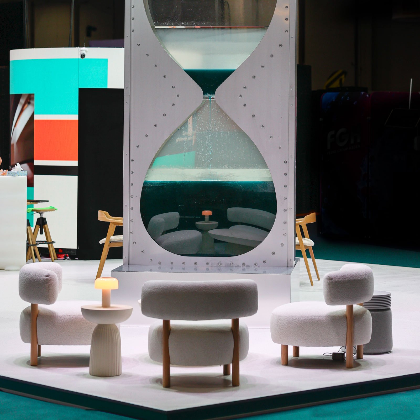
Klarwin ExpoApa 2026 main stand with the Water Countdown hourglass — event branding by Brandient
Klarwin ExpoApa26 StandTransforming an expo-stand into a brand statement
Anul Nadia Comăneci
Anul Nadia ComăneciBranding the year of the perfect 10
Sports Festival circular emblem with heart, ball and sun icons on dark blue — by Brandient
Sports FestivalThe Grand Stage of Movement Celebration
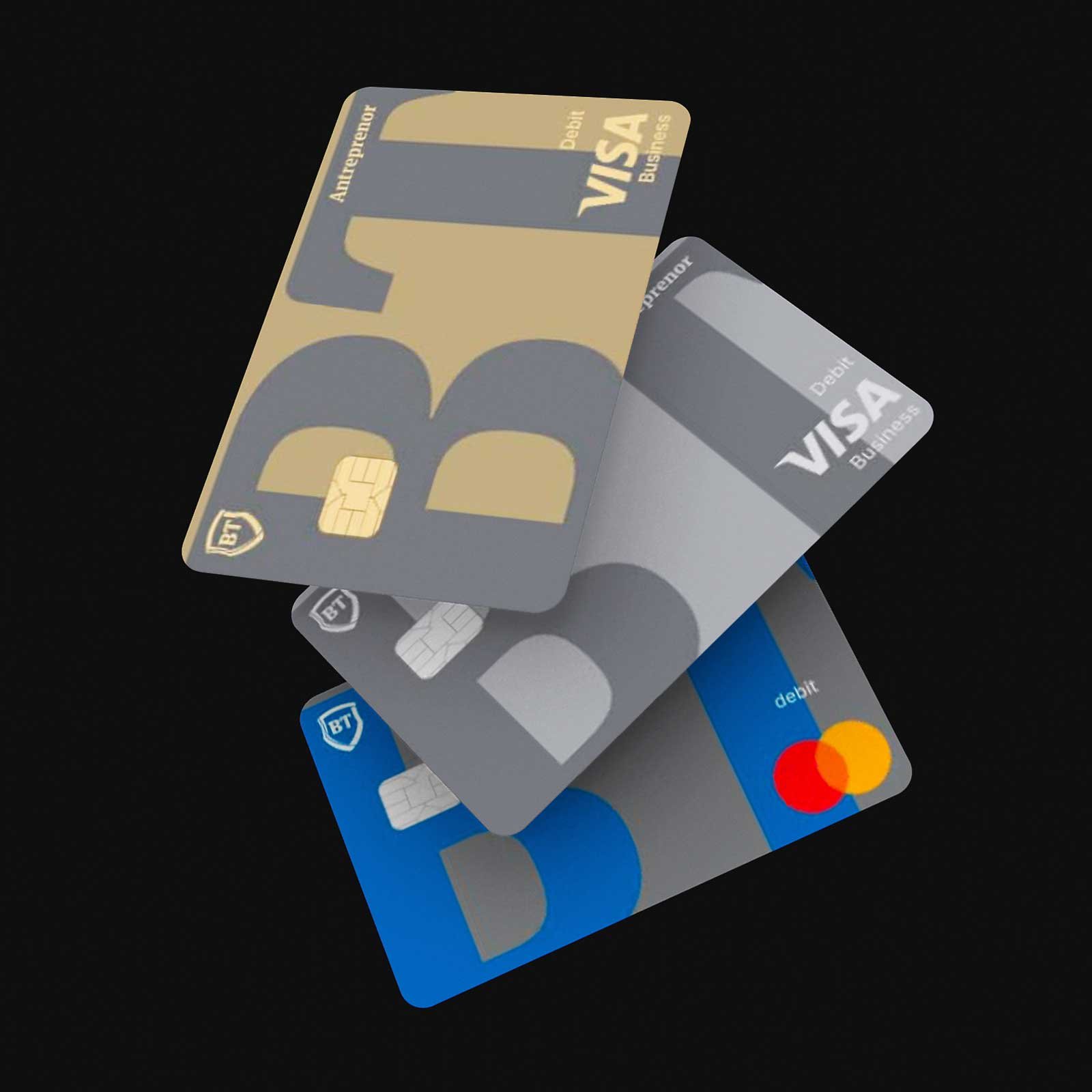
BT Cards
BT CardsA single master card-design system built to carry Romania's largest card portfolio
Good Routine Wellness Foods
Good Routine Wellness FoodsA natural extension of the Good Routine private label, by Secom
Profit Point connected-node logomark forming a P on yellow background — brand mark by Brandient
Profit PointFrom a scattered roster of names to one financial-education network
RoPay
RoPayFrom a feature in every bank's app to a national brand
Solaris packaging range flat-lay — new brand creation by Brandient
Solaris — packaging design systemA scalable packaging design system for a 600-product portfolio
yam brand identity — purple wordmark with white robotic arm pouring into a yam cup by Brandient
YAM You Are MoreCreating the first robo-barista platform in Romania
Zmeu cafea artizanala logo in white on orange background — logo by Brandient
ZmeuA daily coffee with the wit of a folk-tale dragon
CoffeEast symbol — new brand creation by Brandient
CoffeEastBranding Eastern Europe's first specialty coffee festival
Edge Institute brand identity — new brand creation by Brandient
Edge InstituteBranding a movement for the digital acceleration of Romanian society
Evrixa key visual — new brand creation by Brandient
EvrixaTurning Orange Money's platform into a digital-banking brand
Flanco Smart Discounter roundel badge in navy, red and yellow — logo by Brandient
Flanco Smart DiscounterBusiness transformation through rebranding, repositioned as the First Smart Discounter
Rebound Technologies
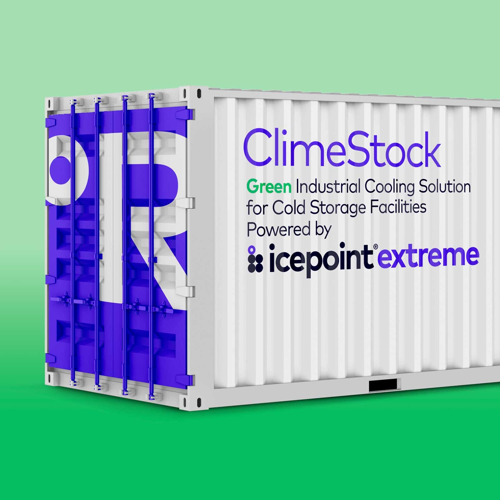
Rebound TechnologiesNaming and surface design for a grid-interactive cooling technology
Team Romania logo — French L'Équipe de Roumanie lockup, design upgrade by Brandient
Team RomaniaThe first commercial emblem of the Romanian Olympic team
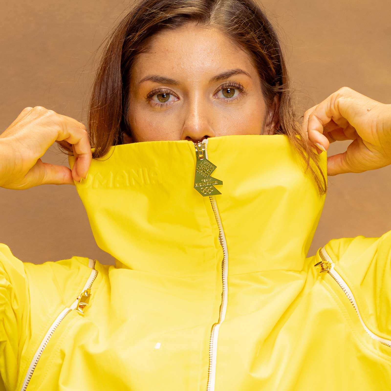
Team Romania's Paris 2024 Olympic parade outfit — the yellow jacket carrying the new Team Romania emblem, the emblem also forming the gold zip-pull.
Team Romania Olympic CostumesTeam Romania's new emblem, made wearable for the Paris 2024 opening ceremony
DLA Piper brand identity — 'Law & Tax. Excellence. Soul.' key visual by Brandient
DLA Piper DinuA 15th-anniversary communication concept and a "Future of Law" art collection
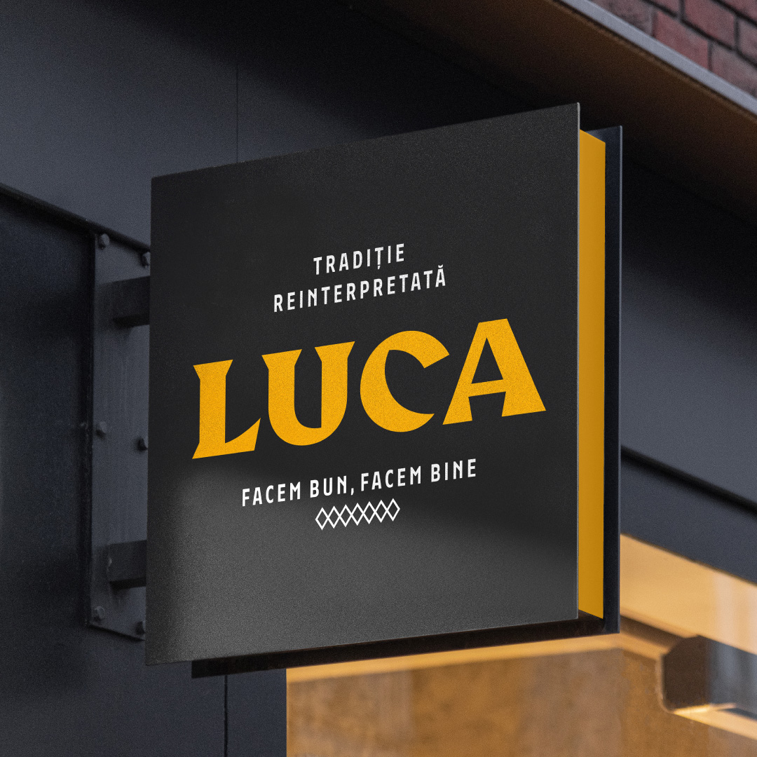
LUCA signage — rebranding by Brandient
LucaAn upgrade for a street-food category leader
Origo logo — white and orange wordmark with letters hanging on strings, rebranding by Brandient
Origo CoffeeRebranding the pioneer of Romanian specialty coffee
Peakture interlocking typographic wordmark in white on dark navy — logo by Brandient
Peakture HotelPeak meets picture — a hotel named for its view
Ryt Bank app icon, light tile with navy Ryt wordmark on navy — by Brandient
Ryt Digital BankBuilding the right bank for Malaysia
Teknopure logo — navy arrows passing through filter bars on blue sky by Brandient
TeknopureA new brand for the air-purification market
Travel Carpathia logomark, looping white lines forming a C on green — logo by Brandient
Travel CarpathiaA conservation-rooted travel brand for the Fagaras wilderness
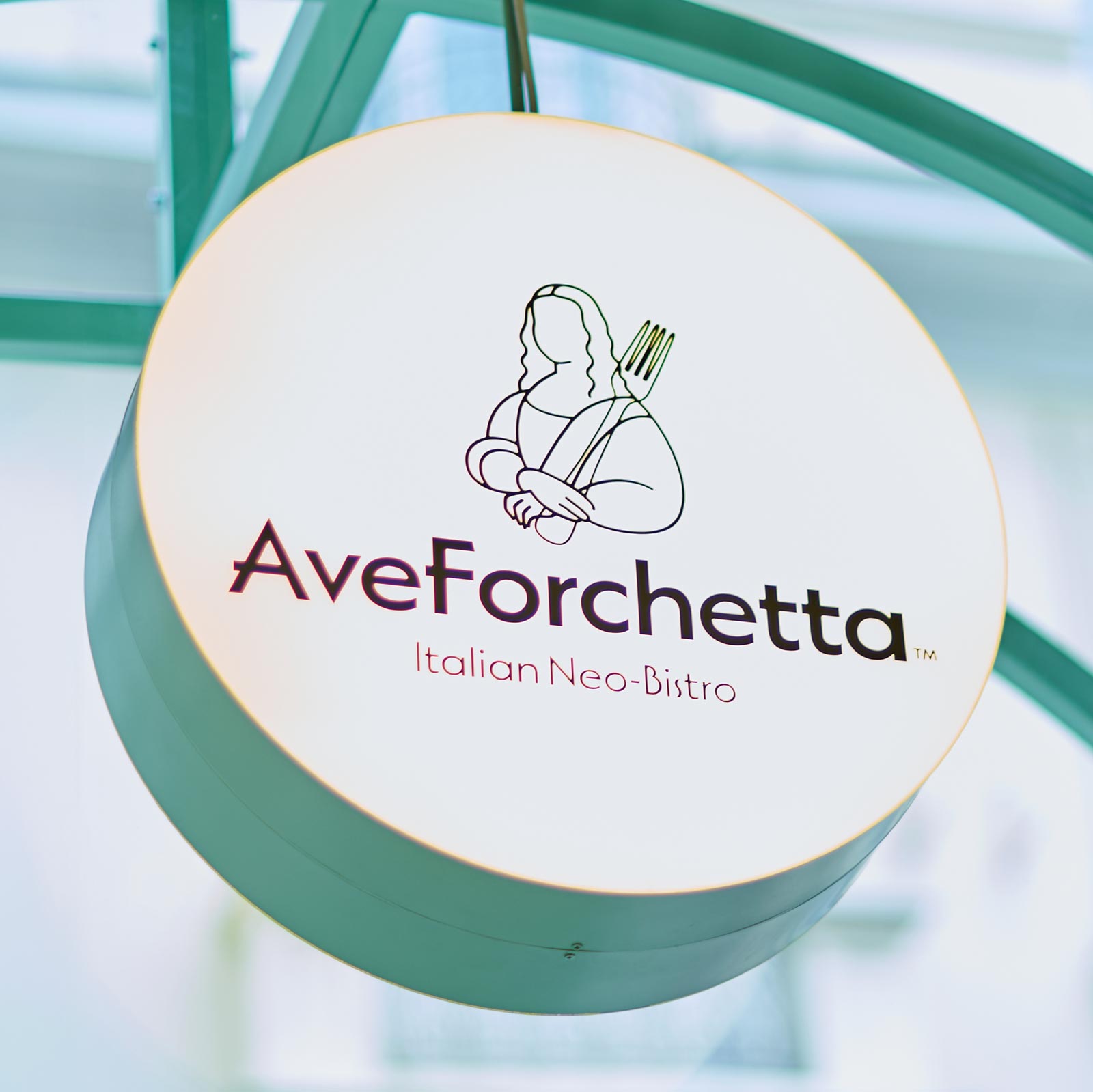
AveForchetta brand identity — round lightbox sign with Mona Lisa fork logo by Brandient
Ave ForchettaAn Italian neo-bistro brand for the post-pandemic table
Cellficient key visual — radiating cyan to magenta dot pattern on navy by Brandient
Cellficient AIBranding Nanoramic's AI layer for battery-cell efficiency
Oradea Fortress white logo with pentagon and heart mark on red — logo by Brandient
Cetatea OradeaThe medieval heart of the city beats to ultramodern rhythms
Exavet symbol — new brand creation by Brandient: cluster of red, pink and purple geometric shapes forming an animal
ExavetA veterinary lab for the "extended family"
Libris logo — rebranding: white stacked serif wordmark on navy, by Brandient
LibrisReigniting passion for books in the digital age
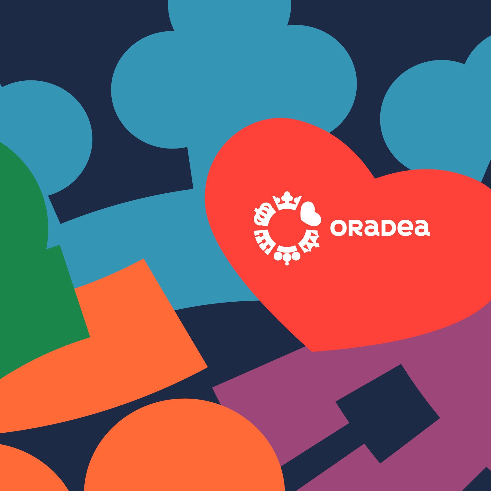
Oradea heart emblem with crown icon over colorful folk-motif shapes key visual — by Brandient
City of OradeaPlace branding at the edge of the discipline: a city whose reality had outrun its reputation
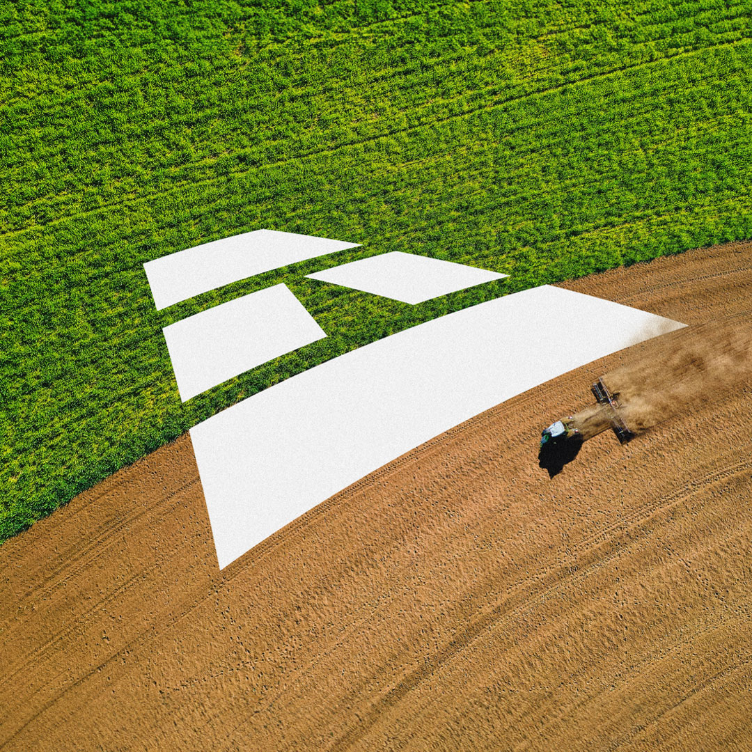
Agricover brand identity — aerial farm field with logo symbol, rebranding by Brandient
AgricoverA next-generation brand for the leader of Romanian agribusiness
Bluid dark blue bottle close-up with white logo and tagline — packaging by Brandient
BluidCreating a brand for a revolutionary reinvention of water
Brewzeus
BrewzeusA specialty-coffee brand made exclusively for a retailer
Freshful courier in green polo holding logo paper bag — new brand creation for Dante International by Brandient
FreshfulBranding the convenience of fresh groceries delivered to your door
HeyBlu symbol — white jumping mascot on blue with playful pie shapes, new brand creation by Brandient
HeyBluNew digital brand creation for an international consumer-credit fintech
Transilvania Investments white bird symbol on orange square — logo by Brandient
Transilvania InvestmentsA former SIF given a modern identity for new investment opportunities
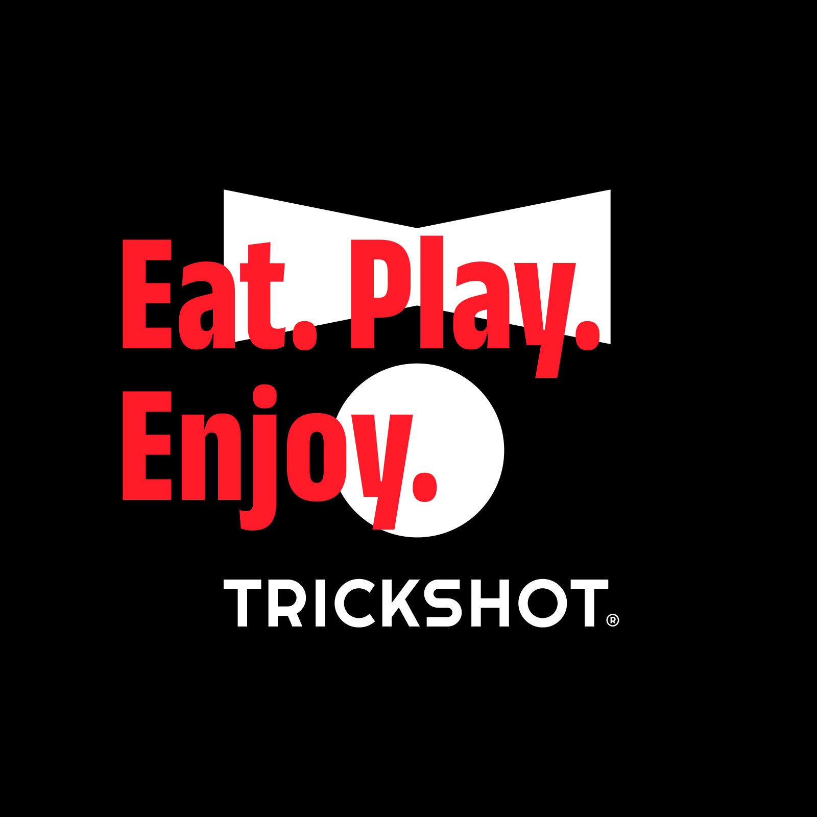
Trickshot Eat. Play. Enjoy. key visual — rebranding by Brandient
TrickshotRepositioning an "eatertainment" restaurant chain for growth
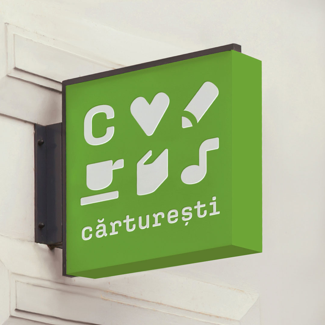
Cărturești signage — rebranding by Brandient
CărtureștiRebranding an iconic Romanian national bookstore for today's audience
Dăruiește Viața
Dăruiește ViațaBecause there is no better cause than life
Fashion Days symbol — D-shaped mark framing white B over blue swirl, rebranding by Brandient
Fashion DaysFashion for real life — "the extraordinary of normality"
Impetum Group logo with sphere symbol on purple by Brandient
Impetum GroupA holding renamed for impetus — a force for business value
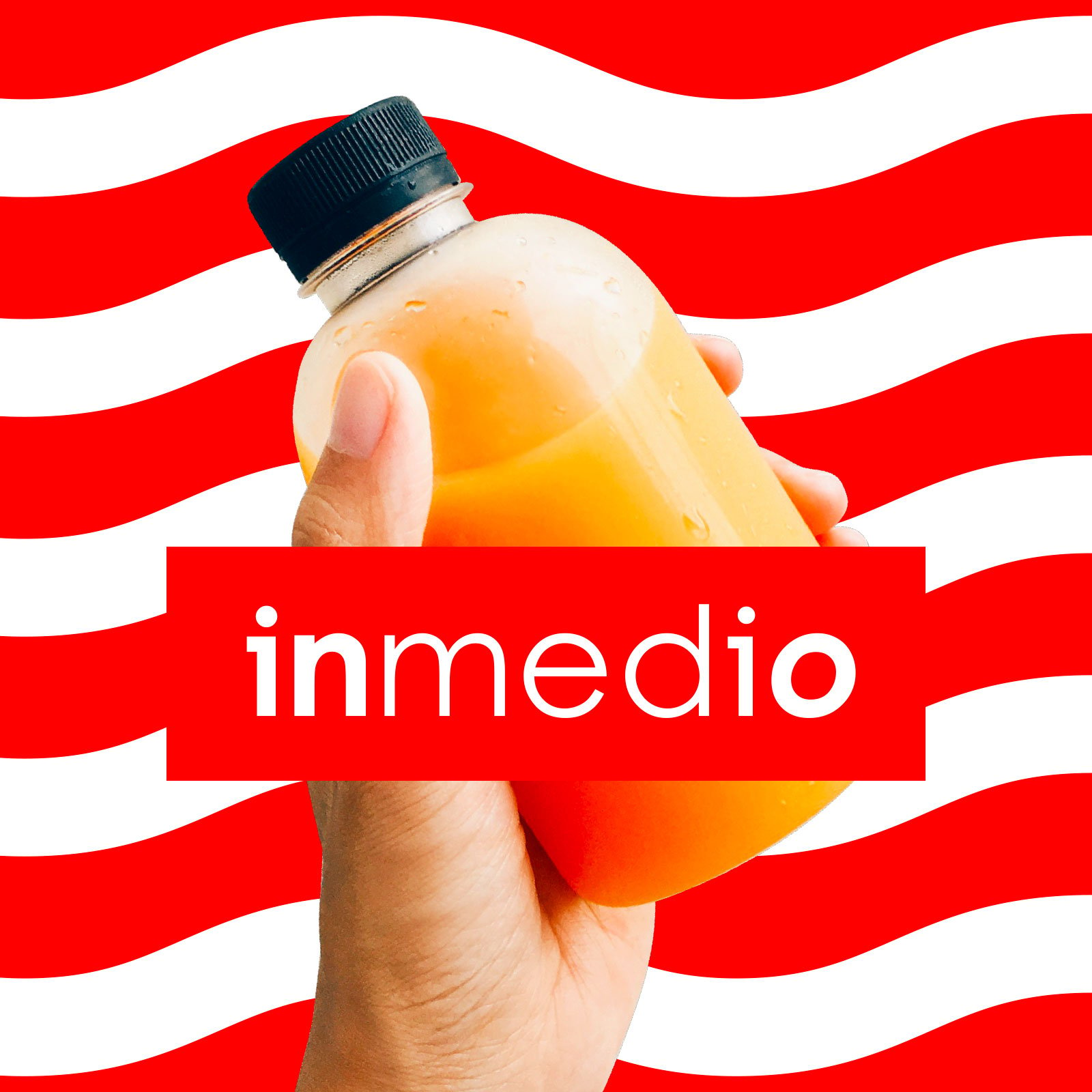
Inmedio brand identity — rebranding by Brandient
InmedioIn the middle of your daily routine
LoginRO brand identity — 'join us' key visual, new brand creation by Brandient
LoginRoPositioning Romania as a destination for young tech talent
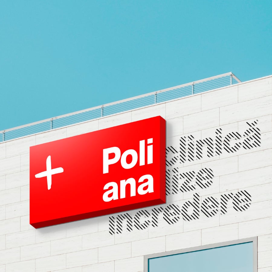
Poliana exterior signage — rebranding for Regina Maria by Brandient
PolianaDemocratizing healthcare through a national network of medical-analysis labs
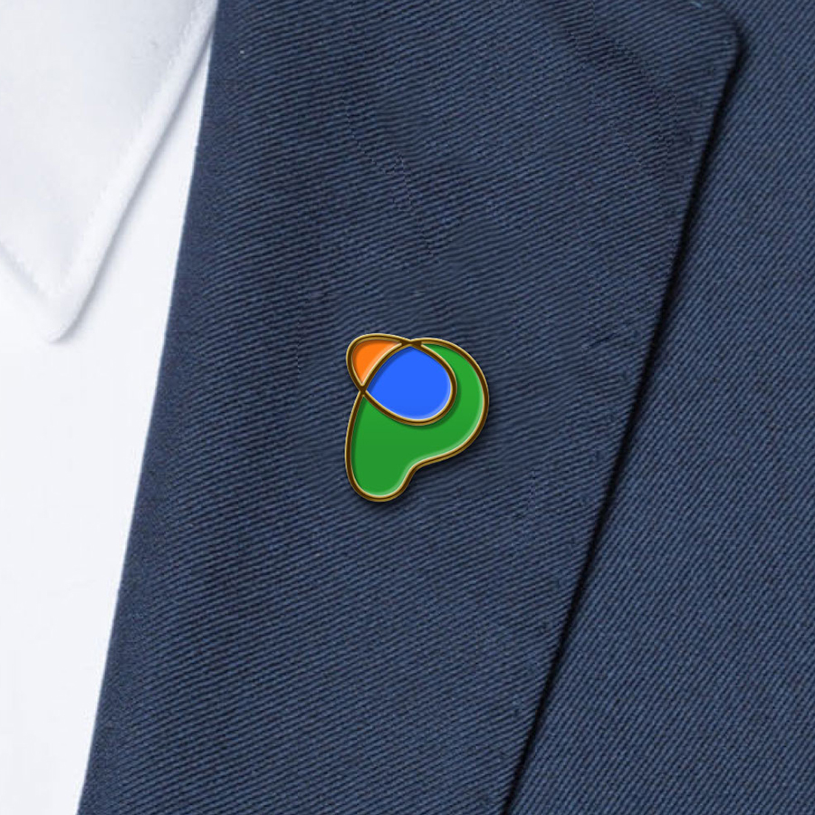
Promateris merchandise — green, blue and orange enamel P-symbol lapel pin, rebranding by Brandient
PromaterisMaterializing a new evolutionary chapter in the local plastics industry
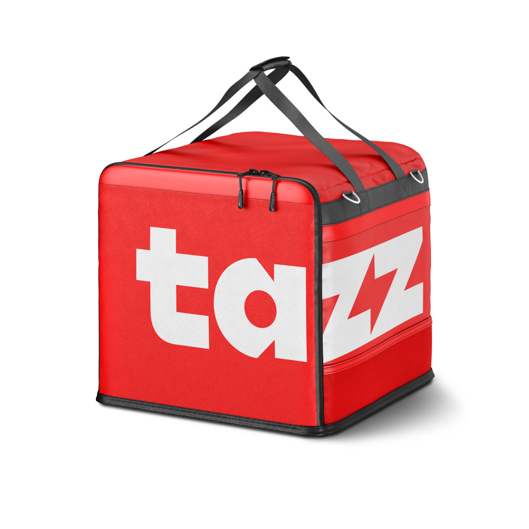
Tazz delivery bag with red and white logo — new brand creation by Brandient
TazzUnstoppable speed, with a hidden lightning flash
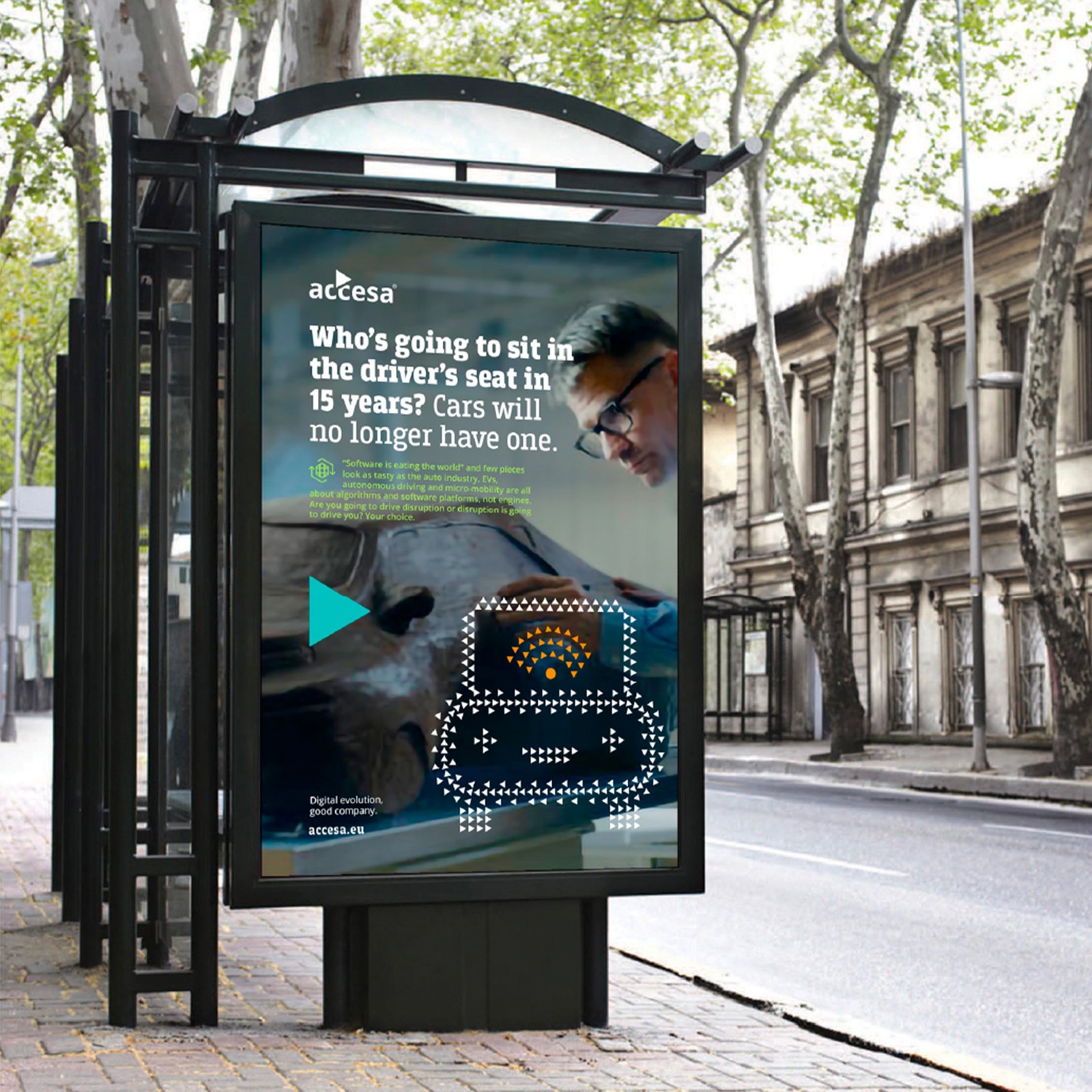
Accesa bus-shelter billboard about autonomous cars with dotted car icon — outdoor ad by Brandient
AccesaFrom staff augmentation to digital-transformation partner
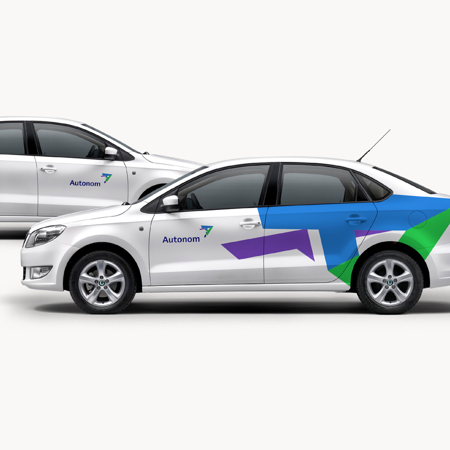
Autonom car livery on white sedans — rebranding by Brandient
AutonomBringing order and visibility to a fast-growing mobility portfolio
Equiliant symbol — new brand creation by Brandient
EquiliantSupporting growth — a brand for an SME investment fund
MerchantPro logo — rebranding by Brandient
MerchantProThe complete platform for small and growing online businesses
NeoBT brand identity — new brand creation by Brandient
Neo BTA new digital experience from Banca Transilvania
O’MAC logo in white with orange apostrophe over green foliage — rebranding by Brandient
O'MACRebranding the challenger in small-agriculture retail
PeliPartners
PeliPartnersThe spirit of partnership, belonging and commitment
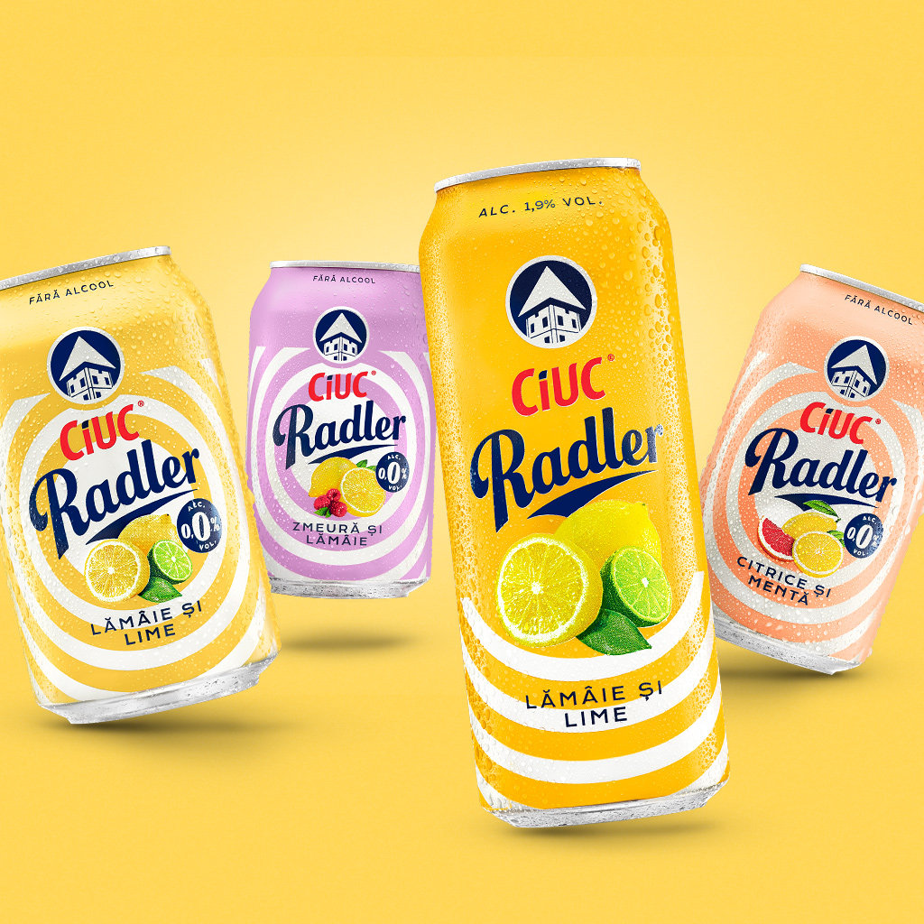
Ciuc Radler product packaging range — design upgrade by Brandient
Ciuc RadlerThe Radler that nearly outstrips supply
FRF logo — pentagon crest with red, blue, yellow shields, rebranding for Federatia Romana de Fotbal by Brandient
Romanian Football FederationRejuvenating the FRF brand to support the Federation's reform agenda
Victoriabank white V flag symbol on blue fabric — rebranding by Brandient
VictoriabankRevitalizing the oldest commercial bank in Moldova, under Banca Transilvania's watch
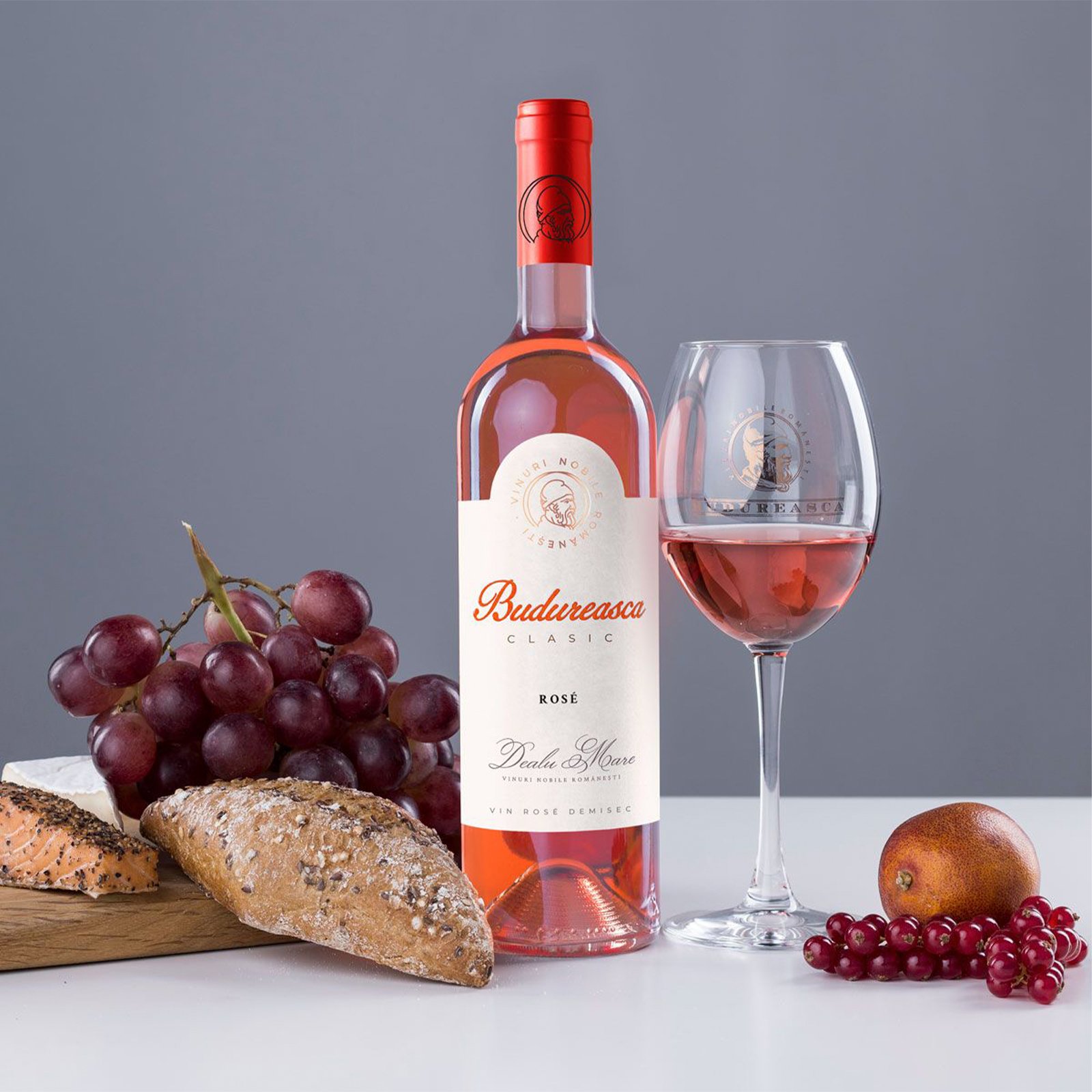
Budureasca Clasic Rose wine bottle packaging by Brandient
Budureasca ClasicThe everyday range, redrawn around a ritual of joy
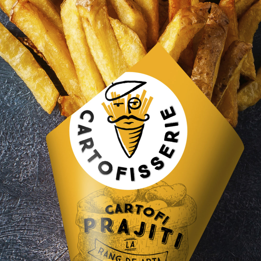
Cartofisserie packaging — new brand creation by Brandient
CartofisserieBuilding a French fries emporium brand
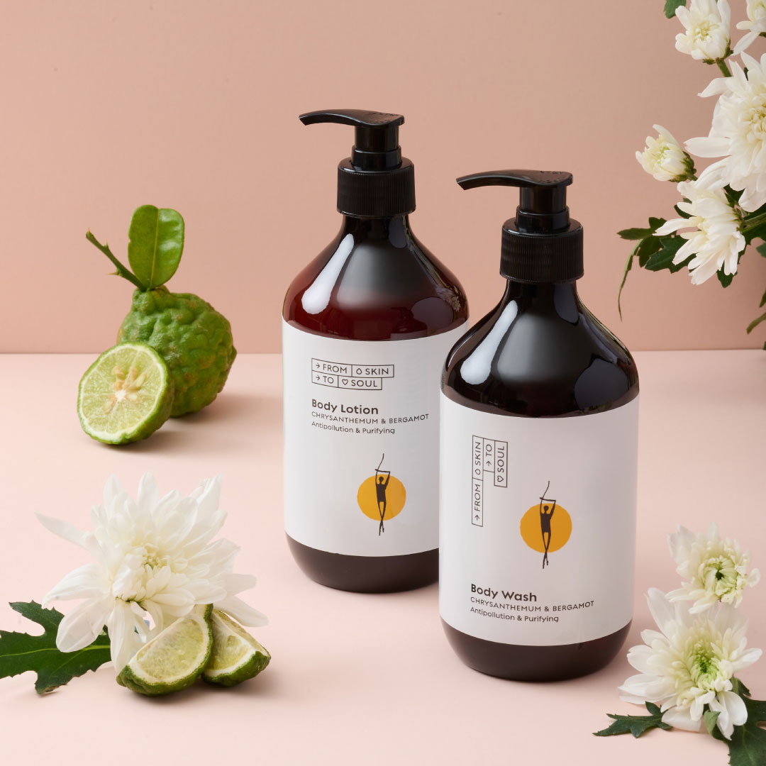
From Skin to Soul body lotion and wash packaging — new brand creation by Brandient
From Skin to SoulA purpose-led vegan body-care brand — care that gives back
Geneco G symbol over Singapore skyline — new brand creation by Brandient
GenecoA challenger energy retailer for a deregulated Singapore market
Stockday logo — green and red wordmark with shopping-cart formed letter by Brandient
StockDayRomania's first B2B digital trading platform
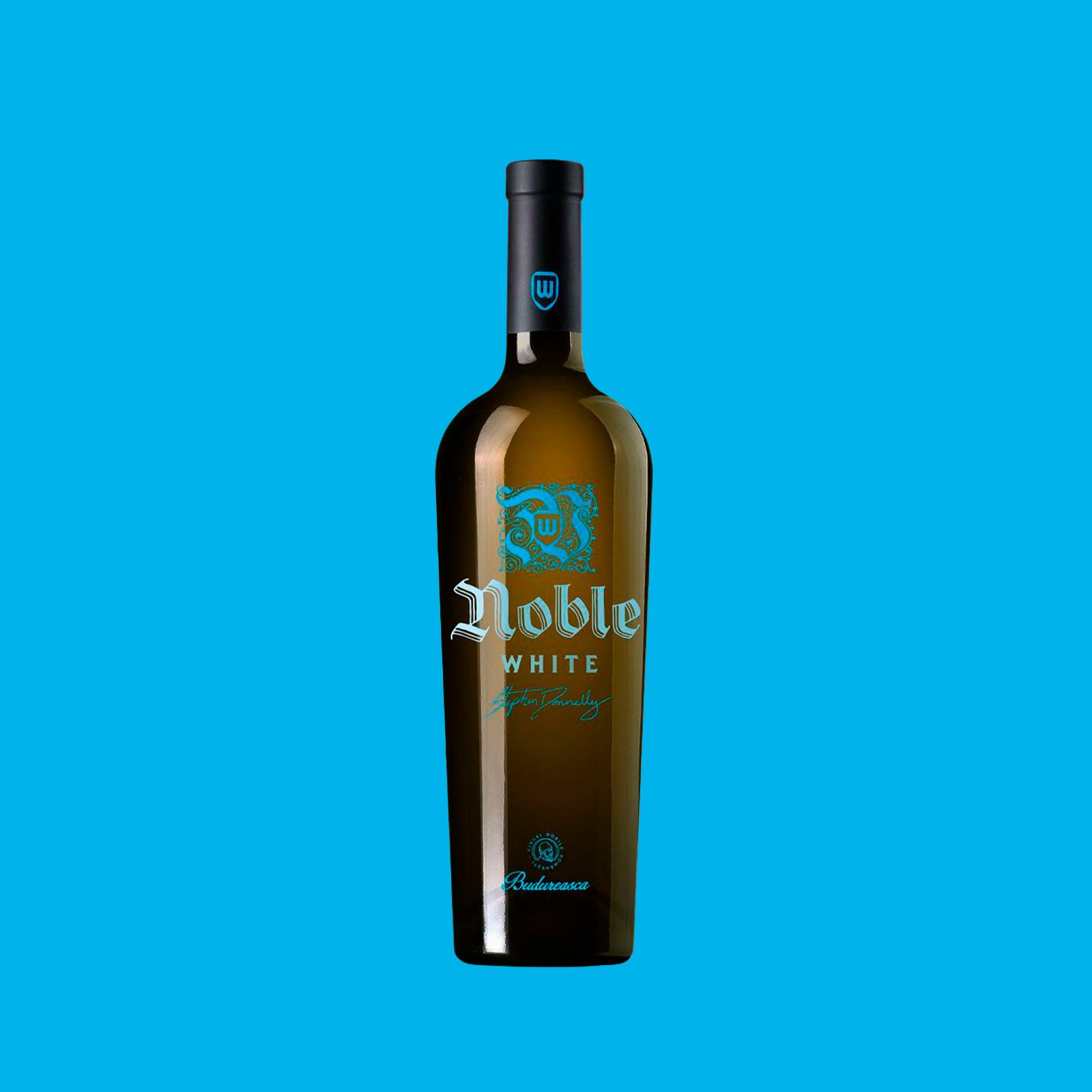
Noble White Budureasca wine bottle packaging by Brandient
Budureasca NoblePremium cuvées, printed on glass and sealed in heritage
Europa FM logo — rebranding brand upgrade by Brandient
Europa FMRefreshing the first national private radio station
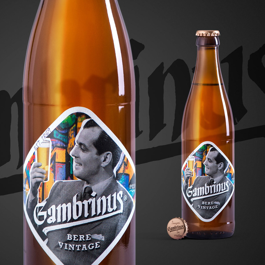
Gambrinus bere vintage bottle label packaging — rebranding by Brandient
GambrinusThe Local Vintage beer of the City
Homplex — Symbol Thumbnail by Brandient
HomplexRenaming a gas-devices brand for the connected home
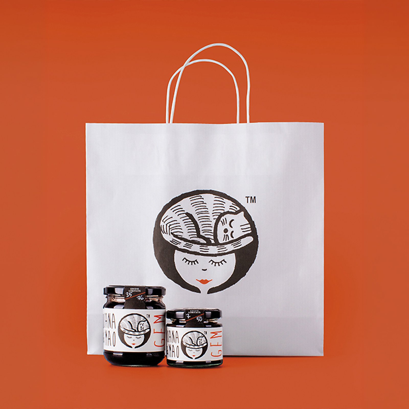
Ioana Mao jam jars and paper bag with sleeping-cat face illustration — packaging by Brandient
Ioana & MaoA logo for a maker of artisanal jams
Neumarkt Original Pils beer logo label by Brandient
NeumarktA medieval name, brewed modern
Pluriva logo symbol, green and blue segmented gear-like circle — logomark by Brandient
PlurivaA smooth, functional mechanism to the benefit of its customers
Patria Bank
Patria BankA young bank with a mature identity
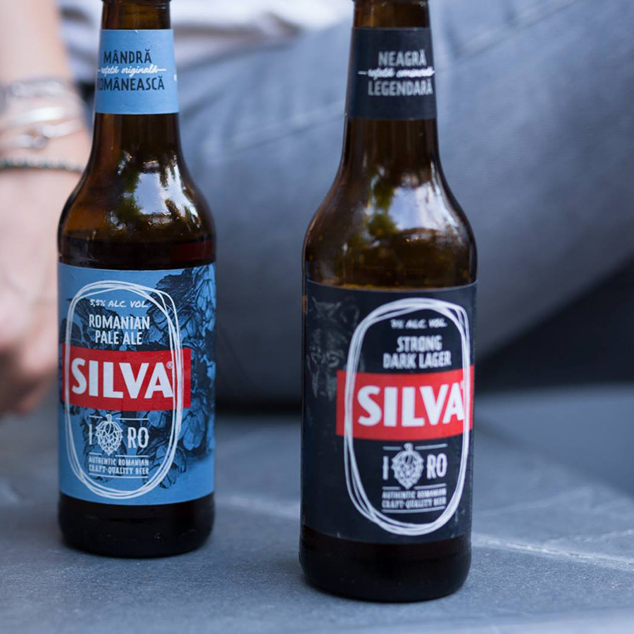
Silva bottle packaging — blue Romanian Pale Ale and Strong Dark Lager, rebranding by Brandient
SilvaReviving a heritage Romanian beer brand
Transavia
TransaviaRevitalizing the corporate brand of Romania's poultry leader
YTL Group
YTL GroupBuilding the Right Thing: a corporate brand for a Malaysian conglomerate
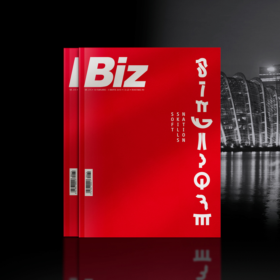
Biz magazine cover — red “Soft Skills Nation / Singapore” issue, with Marina Bay skyline backdrop
BIZ magazine Singapore issueAward-winning Singapore-inspired cover design
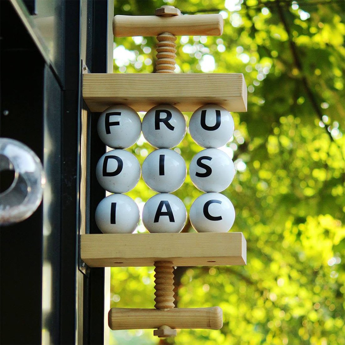
Frudisiac hanging blade sign with white lettered balls in wooden fruit press — signage by Brandient
FrudisiacHandcrafted identity for a Scandinavian-style juice bar
Idea Bank logo in white with handwritten tagline Fresh banking from Poland on blue — brand localization for Getin Holding by
Idea BankFresh banking from Poland
Klarwin logo — rebranding, teal layered wave symbol above wordmark on blue, by Brandient
KlarwinLeaping to a higher reputation league of Fluid Perfection
National Football Team brand identity crest — rebranding for Romanian Football Federation by Brandient
National Football TeamA visual identity for Romania's national football team
Cupa Romaniei logo — gold trophy crest with eagle wings on red by Brandient
Romanian Football CupInvigorating a longstanding competition while keeping its heritage
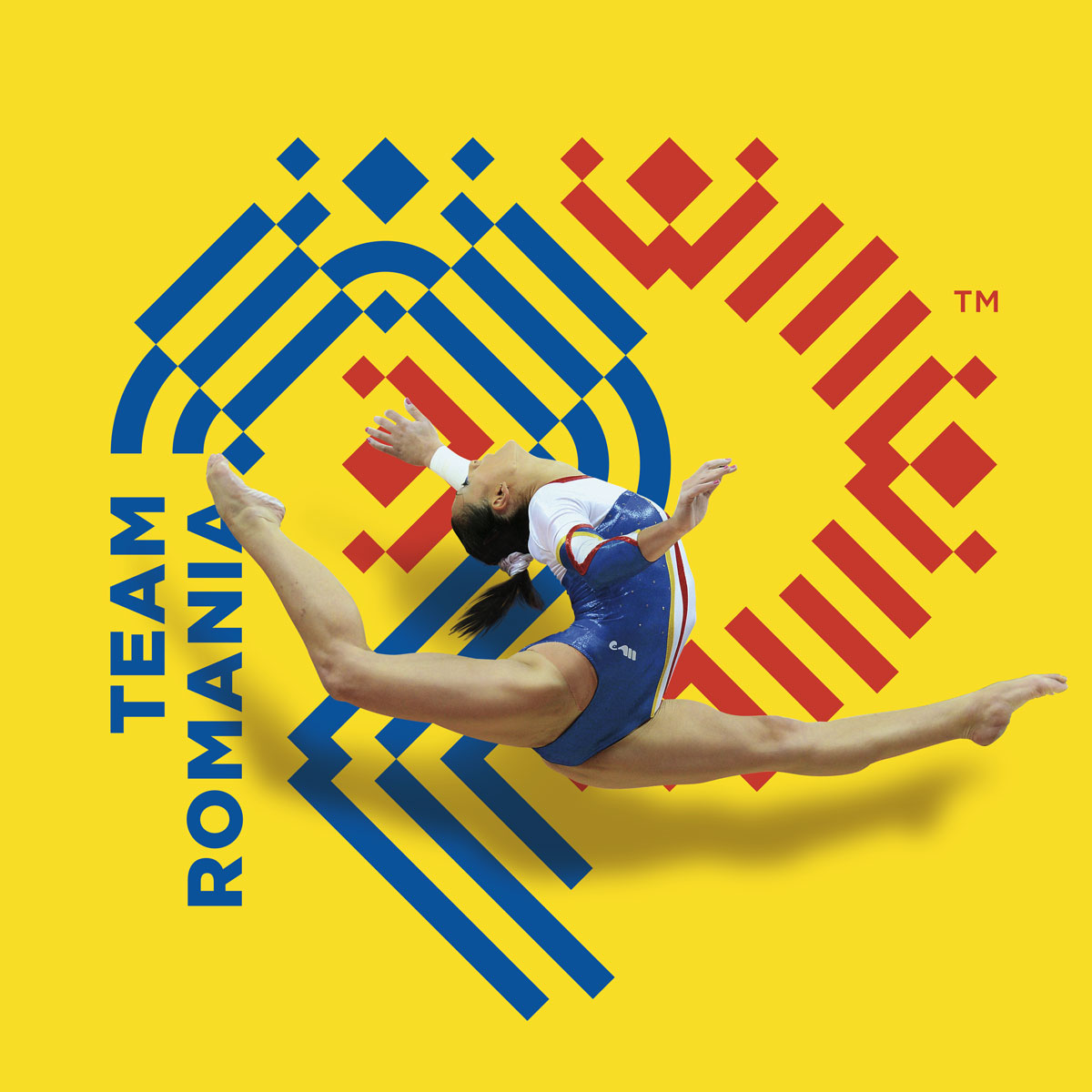
Team Romania key visual — gymnast over blue and red folk-motif emblem by Brandient
COSR & Team RomaniaA dual identity for the Olympic committee, ready for Rio 2016
Terrasigna logo — white wordmark with arc mark over Earth from space by Brandient
TerrasignaGiving a pioneering Earth-observation company a brand as exacting as its science
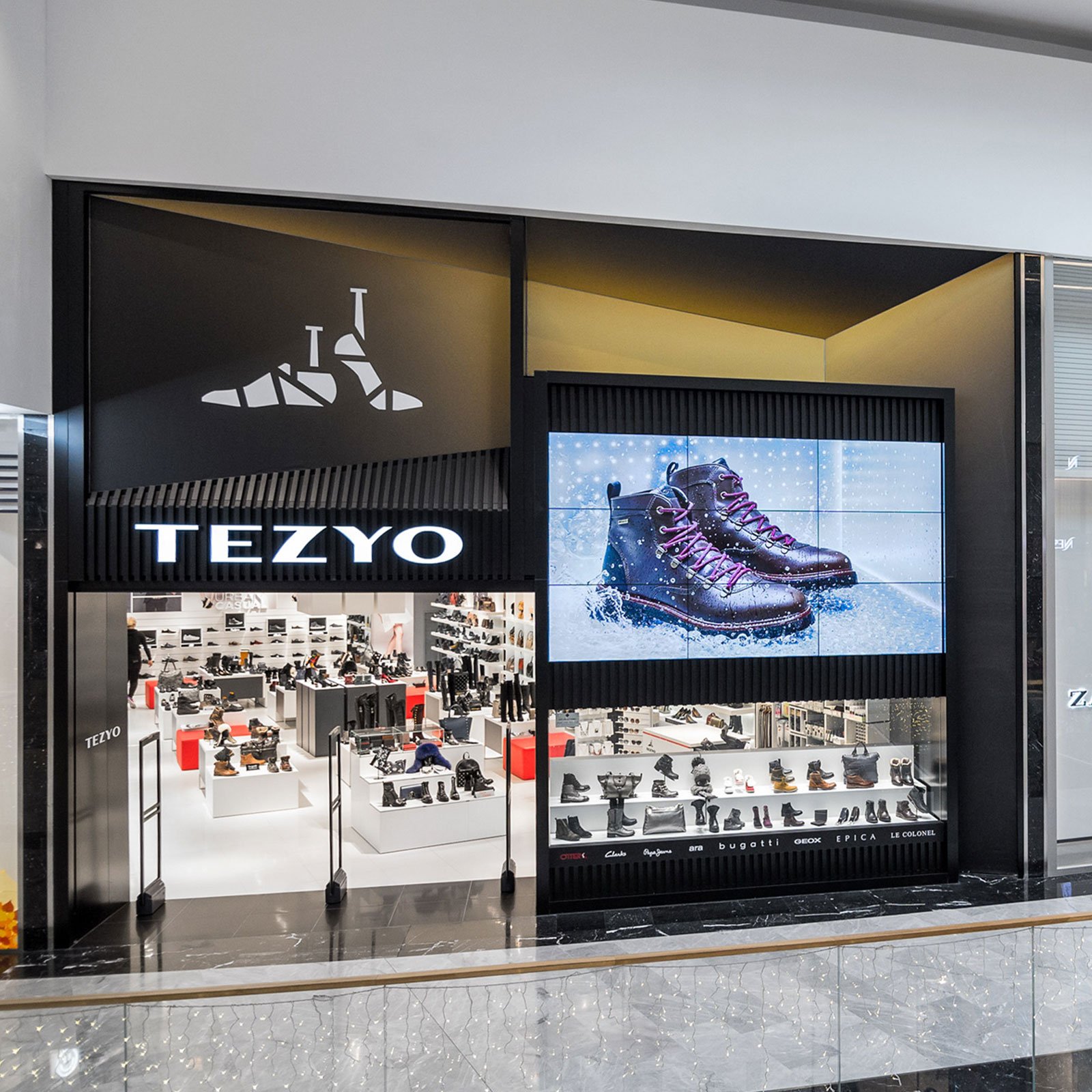
Tezyo Stores
Tezyo StoresA new name and store-brand for younger, urban footwear
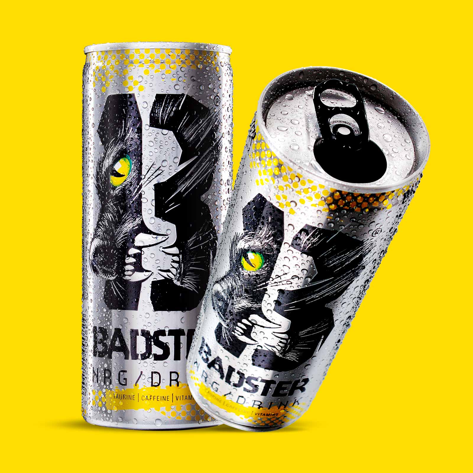
Badster energy drink can packaging — new brand creation by Brandient
BadsterA rule-breaking private-label energy drink, built to win on the can
Balvanyos Resort
Balvanyos ResortRelaxation and rejuvenation in the heart of the Carpathians
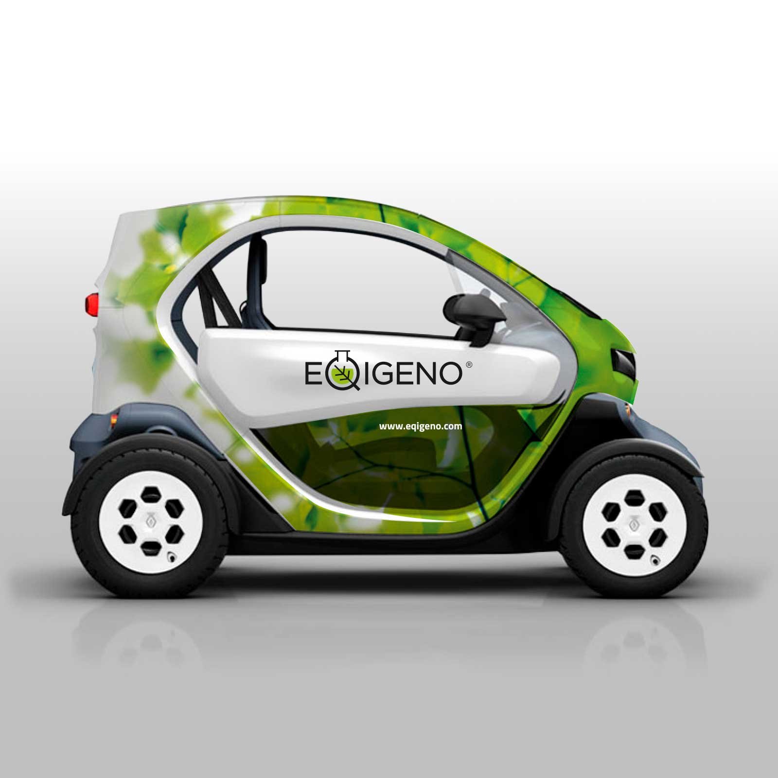
Eqigeno
EqigenoA supplements range where science meets nature
HelpNet symbol — white plaster-cross mark on orange, rebranding by Brandient
HelpNetRepositioning a leading Romanian pharmacy chain
Interactive Group symbol — rebranding brand repositioning by Brandient
Interactive GroupHelping a leading Pakistani IT&C integrator grow a pan-Asian presence
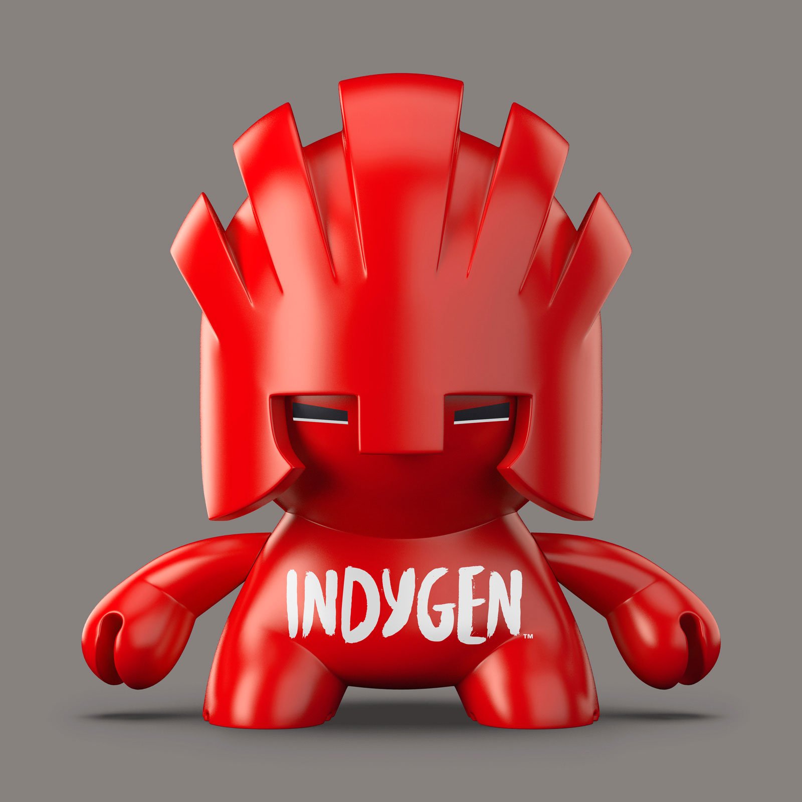
Indygen red mohawk mascot figurine front view with chest wordmark — brand character by Brandient
Indygen for VodafoneA new telco brand for the smartly connected generation
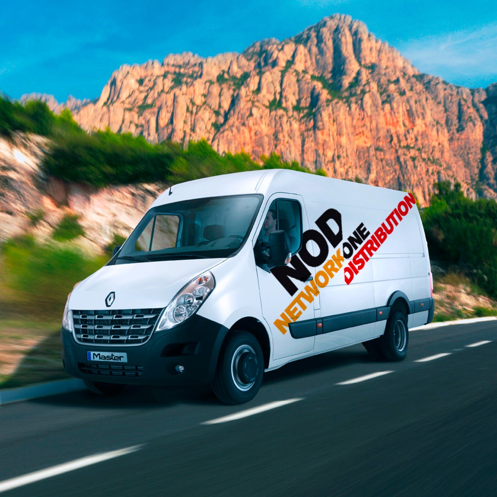
NOD Network One Distribution branded white delivery van on mountain road — livery by Brandient
Network One Distribution NODA flexible, dynamic identity for a distribution leader
Tall Ball
Tall BallA sports-gear brand built from the values of the game
Tunisiana logo — red wordmark with square mark and Arabic script by Brandient
TunisianaRepositioning Tunisia's leading mobile operator around the customer's future
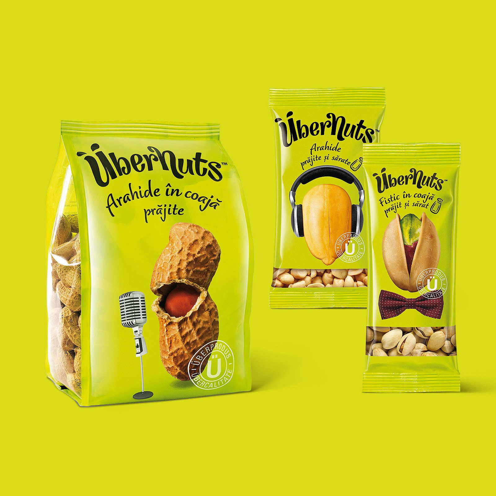
UberNuts snack packs with peanuts, headphones and microphone artwork — packaging by Brandient
ÜbernutsA challenger brand in the nuts-and-seeds category
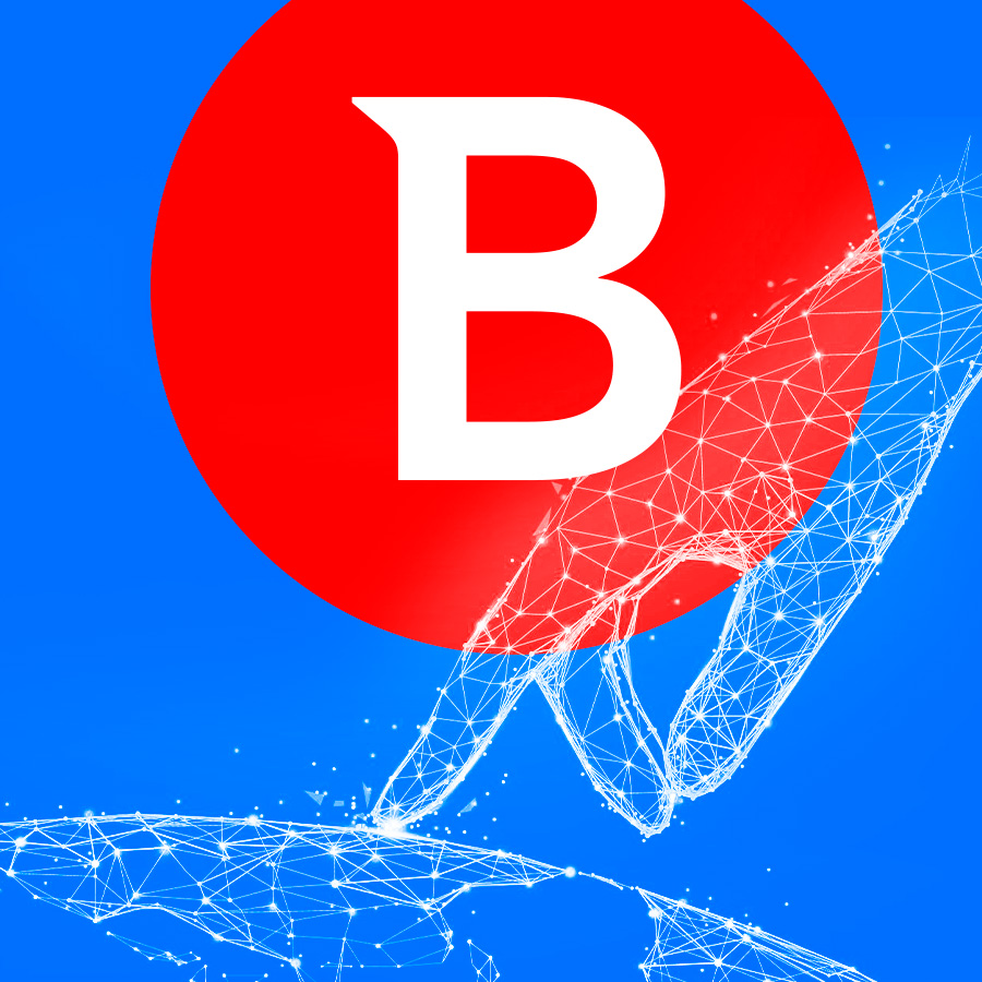
Bitdefender brand identity — red and white B logo over wireframe hand, rebranding by Brandient
BitdefenderA decade of rebranding and design for a global cybersecurity leader
Senia Music logo — black cat playing a harp icon on textured paper by Brandient
Senia MusicA retail identity for a musical-instruments store
VES logo — white centaur blowing horn and wordmark on red by Brandient
VESA corporate identity rooted in Saxon craft heritage
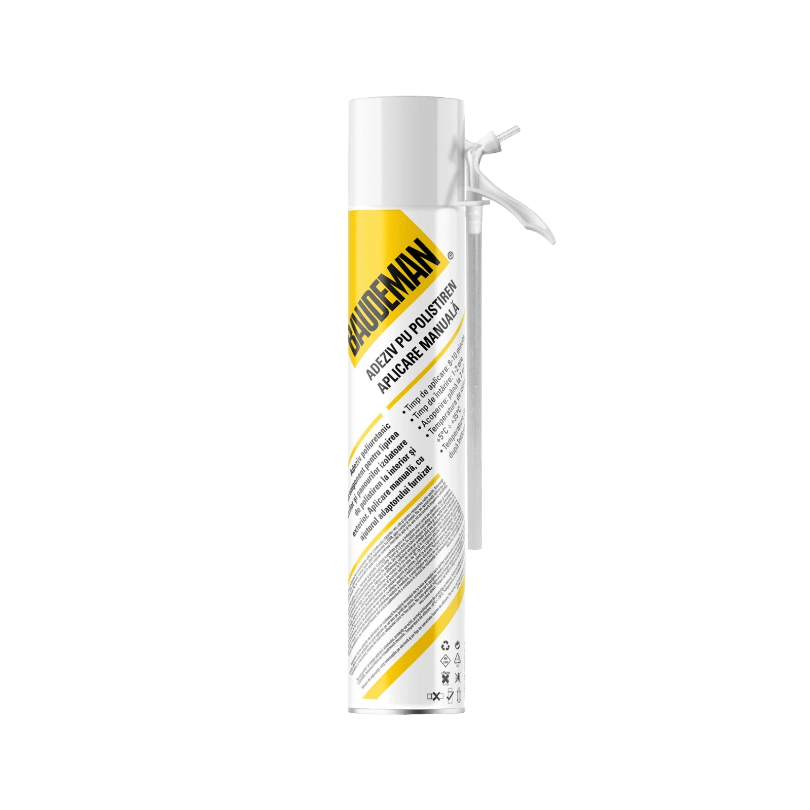
Baudeman PU polystyrene adhesive foam can, manual applicator — packaging by Brandient
BaudemanA private label, engineered like the products it carries
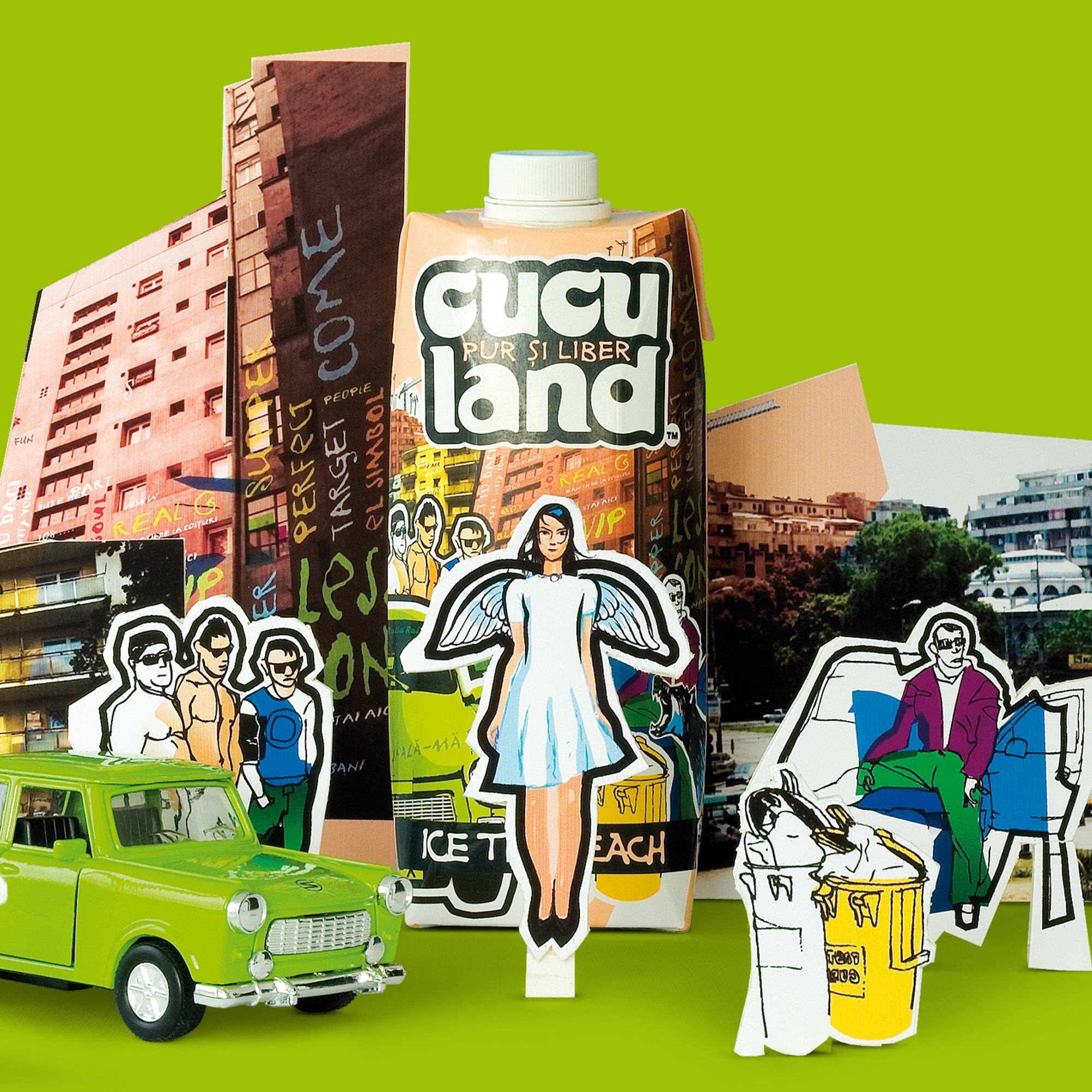
Cuculand product packaging with hand-cut collage figures and green car by Brandient
CuculandA cult ice-tea brand inspired by contemporary Romanian life
Dedeman symbol — rebranding by Brandient
DedemanTwo decades building Romania's DIY leader and its private-label portfolio
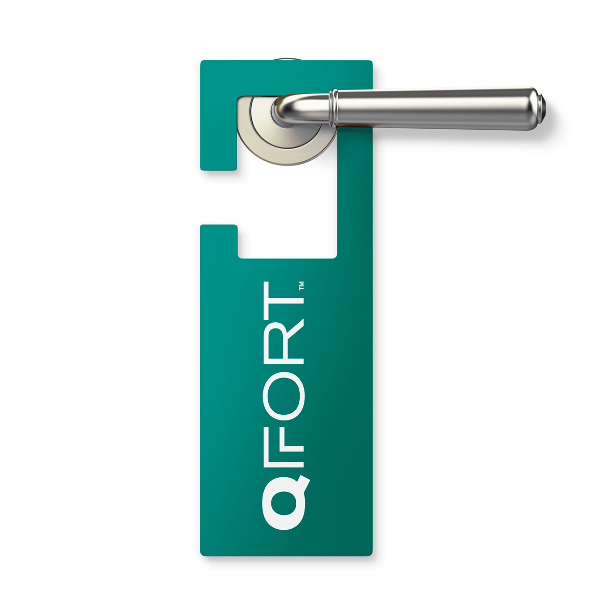
QFort door hanger merchandise — rebranding by Brandient
QFortQuality and comfort from the largest window-frame maker in South-Eastern Europe
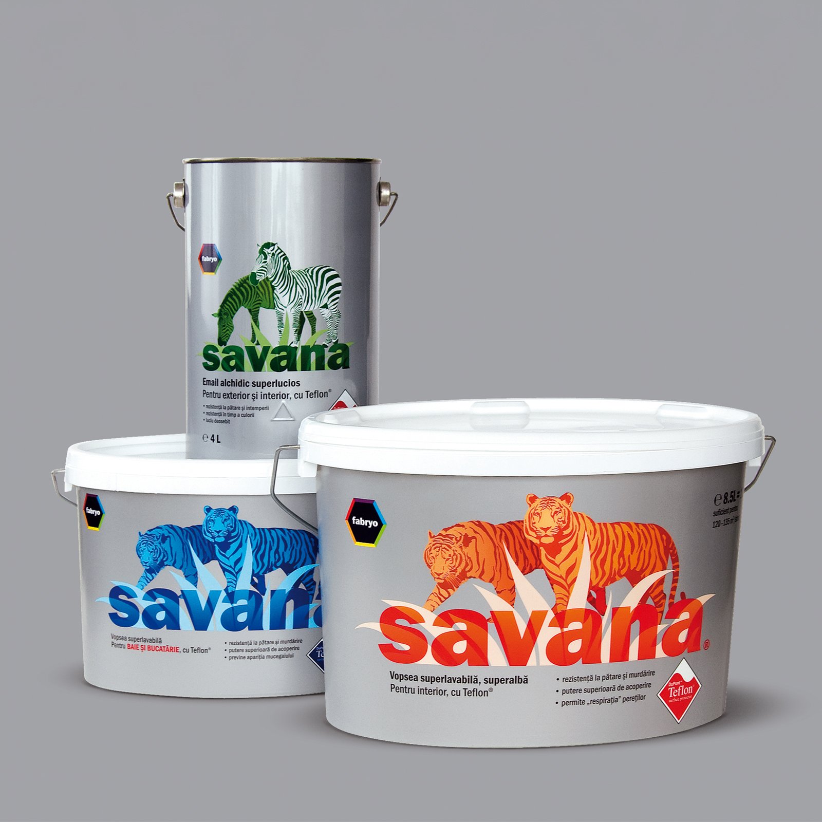
Savana paint cans and buckets with zebra and tiger artwork — packaging by Brandient

SavanaA premium paint brand reimagined, from barren to vibrant
Qualians key visual of a white chess pawn with hand-drawn crown beside a red mark — brand visual by Brandient
QualiansA novel brand for corporate consulting, learning and development
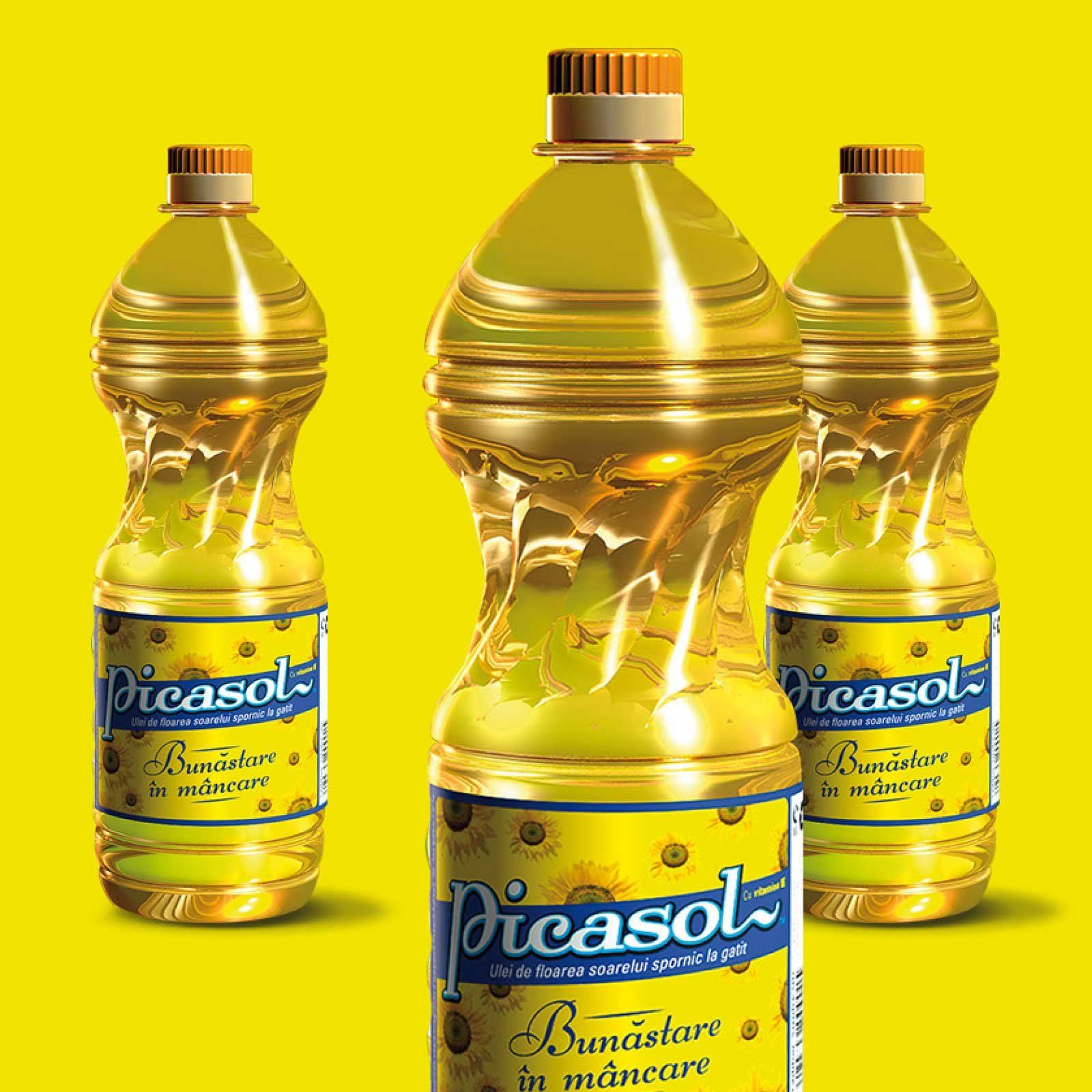
Picasol
PicasolA sunflower-oil brand designed to win on brand, not price

News radar

Join the Brandient community! Stay in the loop with innovative branding insights, exclusive design content, and inspiring case studies.

Stay in touch with Aneta's latest opinions — articles, interviews, and podcasts — on entrepreneurship, marketing, branding pioneering, leadership, and culturally meaningful current events.

Brandient Radar is a select and non-intrusive, low-volume newsletter.

Follow our flight path — sign up for our Radar newsletter today!

get in touch

Client? contact us

5 Mendeleev Street, 3rd floor,
Bucharest 010361

Expert? Join Us

Are you brimming with talent and unshaken by challenges? Then, consider this your invitation to join our elite team, dive into complex problems, and have the opportunity to see your work make a mark far and wide.

Please submit your cover letter and relevant credentials:
Click to e-mail Brandient Careers.

friend? follow us

Copyright © Brandient 2002–2026. All Rights Reserved.