

Anvergo
A name that means scale, a letter shaped like a well
Romania’s oil-and-gas extraction industry runs on a long tail of suppliers — the machinery, tools and consumables that keep wells drilling. It is a fragmented, technical category in which a distributor’s hardest task is simply to be taken seriously: to read as one substantial, national partner rather than one more trader among many.
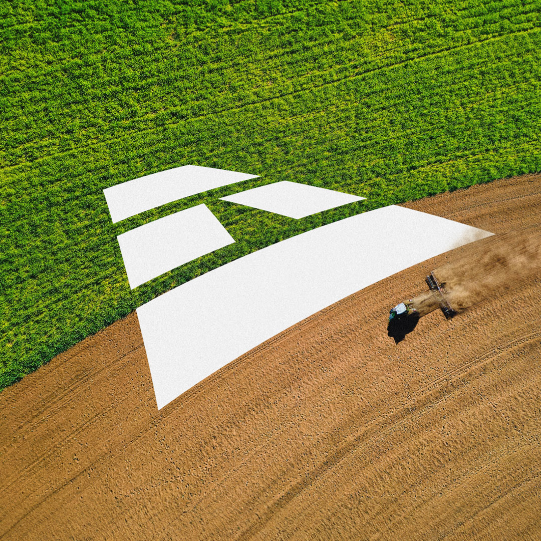
Brandient built the brand around that need for stature. The name comes from the Romanian anvergură — scale, scope, reach — putting the company’s ambition into its very first word. The identity then carries the idea down to the letterform itself: a capital drawn as a stylized drilling well, so the mark states the category and the scale in a single move, and the brand reads as substantial and unmistakably oil-and-gas at a glance.
Client:
Anvergo
Industry:
Utilities and Energy
Project type:
New Brand Creation
Date:
2009
Services:
Brand Name, Narratives and Voice, Logo and Visual Identity Program, Corporate ID Program
Other featured projects







































News radar
Join the Brandient community! Stay in the loop with innovative branding insights, exclusive design content, and inspiring case studies.
Stay in touch with Aneta's latest opinions — articles, interviews, and podcasts — on entrepreneurship, marketing, branding pioneering, leadership, and culturally meaningful current events.
Brandient Radar is a select and non-intrusive, low-volume newsletter.
Follow our flight path — sign up for our Radar newsletter today!
get in touch
Client? contact us
5 Mendeleev Street, 3rd floor,
Bucharest 010361
Expert? Join Us
Are you brimming with talent and unshaken by challenges? Then, consider this your invitation to join our elite team, dive into complex problems, and have the opportunity to see your work make a mark far and wide.
Please submit your cover letter and relevant credentials:
Click to e-mail Brandient Careers.
friend? follow us
Copyright © Brandient 2002–2026. All Rights Reserved.